Color Factory
By: NELSON Worldwide
Back in 2017 one of my favorite blogs, Oh Happy Day, announced a new project called ‘Color Factory’. It was described as a ’12,000 square feet of color experiences’, a collaboration between their favorite artists, designers & chefs to celebrate color, design, and their hometown of San Francisco. All the bright colors and fun looked amazing, but it was also on the other side of the country. THEN, this summer, Color Factory brought their hugely successful exhibit to New York, so during BDNY week, we were able to get tickets and experience the fun firsthand!
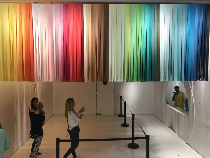
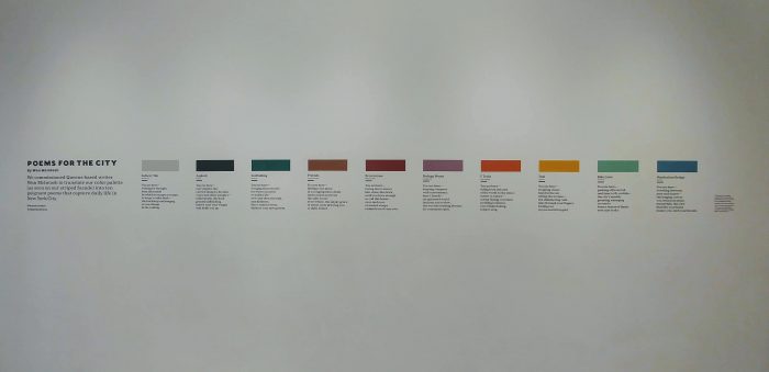
To begin, we entered the ‘lobby’ greeted by a physical manifestation of their colorful, New York-centric website, a display of colors and poems inspired by the streets of New York, and most importantly, mochi ice cream. The space became a holding area where you can hand in your tickets and check your coats before you enter the exhibit. It was explained that we would enter through a series of rooms that let you experience color differently, sometimes there would be an activity, sometimes a food pairing, sometimes selfie stations and sometimes all three. One of the most clever things they did was hand out cards with a QR code that we could scan at different stations which would take a picture of us and send it directly to our email, so we could be hands free!
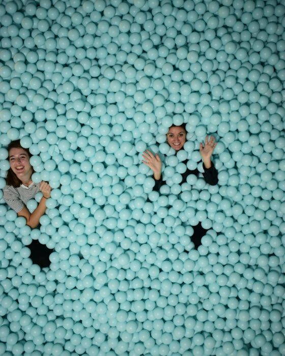
The first room was full of colorful pins, and each person got to pick which color spoke to them (I picked ‘Jet’ which looked to me like an inky blue/purple, but was really just black). As we traveled through the exhibit, we did some activities that made us feel exposed (like staring at your coworker intently, while sketching them without looking at the paper or picking up your pencil), some were a little less exciting than others (like playing plunking on a two note xylophone), some were sponsored by big brands (like the dance party sponsored by Maybelline) and almost all of them had a food pairing (the best one was the blue ice cream from the blue ball pit room).
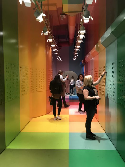

But, I think my favorite rooms focused on the origin of colors and the translation of an experience through color. There was a room about midway through that showed colors named A-Z; each color was mounted on a drawer slide – one side named the color and the other explained its origin. As a designer that digs through color every day; understanding the origin brought more meaning to the palettes we select. Another room translated a palette entitled ‘Thoughts on a Subway on 7/30/2018’, below were listed the ‘thoughts’ and their translating colors gradating from a sunny yellow to a deep midnight blue. The artist then made this observation and palette into a merry-go-round bringing the colors to life (and creating a platform for a cool Boomerang).
The price tag for a ticket is steep ($38/person), but you got a lot of bang for your buck with take-aways, activities & food pairings. If I had any critique, it would be that the rooms sometimes felt disconnected (most likely because of the wide variety of artists they included), sometimes it felt like the procession had meaning and connected to the room before, and sometimes the rooms seemed to stand alone. I almost expected the path to build up to a final New York – centric experience or reveal. The last room featured a GIANT blue ball pit, which was VERY cool, but didn’t seem to speak to the color story inspired by New York. That said, I really did love every minute of this exhibit, surrounded by color, inspiration and artistry, it was hard for me to find something I didn’t enjoy. We spoke with some of the guides along the way, and it sounds like they’re still discussing how long this exhibit will be in place (the one in San Francisco lasted about 8 month), but if you’re in New York and you love color (and who doesn’t?) – this is a must see.

Let's Connect:
NELSON Worldwide,
NELSON Worldwide is an award-winning firm, unlocking value for clients through architecture, interior design, graphic design, and brand strategy. With more than 600 teammates across 20 offices, the firm’s collective network provides strategic and creative solutions that positively impact where people work, serve, play, and thrive. The team combines industry knowledge, service expertise, and geographic reach to deliver projects across the country and around the world. Client partnerships across the NELSON network include Hilton, Macy’s, Comcast, Simon Property Group, Prologis, Yum! Brands, Boston Consulting Group, T-Mobile, Emory Healthcare, SAP Fieldglass, Unibail-Rodamco-Westfield, Kroger, Hyatt, Bayer, Target, and many more.